This was a semester long project completed in 4th year in the Graphic Design for Marketing program at the Wilson School of Design at KPU. This project was meant to stand as our focus project that should represent the type of designer that we are. I chose Club Monaco because it is quite a successful company with a weaker brand identity that hasn’t evolved well with their brand offering.
Club Monaco aims to be an affordable luxury clothing store that offers fashion pieces that are thoughtfully designed with purpose.
PROBLEM DEFINITION AND NEED
Club Monaco is a well-known fashion brand that had gone through changes since it was first opened in 1985. While the style evolved to create a more successful venture for Club Monaco, the company’s overall branding lacked the ability to reflect the changes. Although successful when the company first opened their store, the logo that they are currently using is outdated and doesn’t reflect what Club Monaco as a brand now offers. Although the brand identity is quite successful with brand recognition among the clientele, the overall structure of the brand system doesn’t allow Club Monaco to adapt to the newfound identity in their products. Club Monaco now offers products that are sophisticated, trendy, yet timeless, so the goal was to create a consistent branding system that reflected their most recent change.
With such a wide range of audience that Club Monaco offers their products to, the rebrand would mainly focus on the needs of a smaller target audience. This rebrand project is aimed to target females and males ages 24-30, as they are one of Club Monaco’s largest, most influential target audience in the fashion industry.
STRATEGY
In order to create a more consistent brand identity that better appeals to the target audience, Club Monaco will focus on their elegant, yet trendy products while communicating in a bold and straightforward voice. To please the long-time clienteles of Club Monaco with the drastic change, the approach must be justified, and the changes must be meaningful. The new brand system must not change who Club Monaco is, but emphasize what they stand for instead.
RESEARCH
Research into the fashion industry was done to look into what Club Monaco’s competitors are currently representing themselves as. This research aided in creating a brand identity and system that didn’t blend in with the rest of the competitors. Internal research was done to see how Club Monaco uses their brand elements to elevate their position in the fashion industry and shows what needs to be improved or revised to better help Club Monaco as a brand.
PROCESS
In order to get to the final solution, I began my process by creating a moodboard of fashion pieces that Club Monaco offered, as well as looking towards external resources for fashion images. The moodboard included a colour palette, typography choices, and layout designs as well. I then explored the different directions the logo could possibly go in. After some sketching, I moved the process to the digital artboard, then created and reiterated my ideas there. This allowed me to watch the relationship of each element of the logo work together. I would occasionally print out images of the logo to ensure it worked both in both a digital format and printed format.
The rest of the deliverables used a similar process as the logo development, but most of the layout done for the graphic standards manual was completed in the digital stage rather than the sketching stage.
THE DESIGN SOLUTION
The final design solution includes a new wordmark that is bold and customized to fit Club Monaco’s personality. The way the wordmark communicates with our target audience is important, as the brand will be worn by our clientele. The new logo had to be clean so it could be easily stitched onto clothing, and could be legible from afar. The decision to just have a wordmark comes from the fact that Club Monaco consists of a very clean, and simplistic style. This also caters to the target audience’s need for a simplistic style, so heavy, over-the-top branding does not appeal to them.
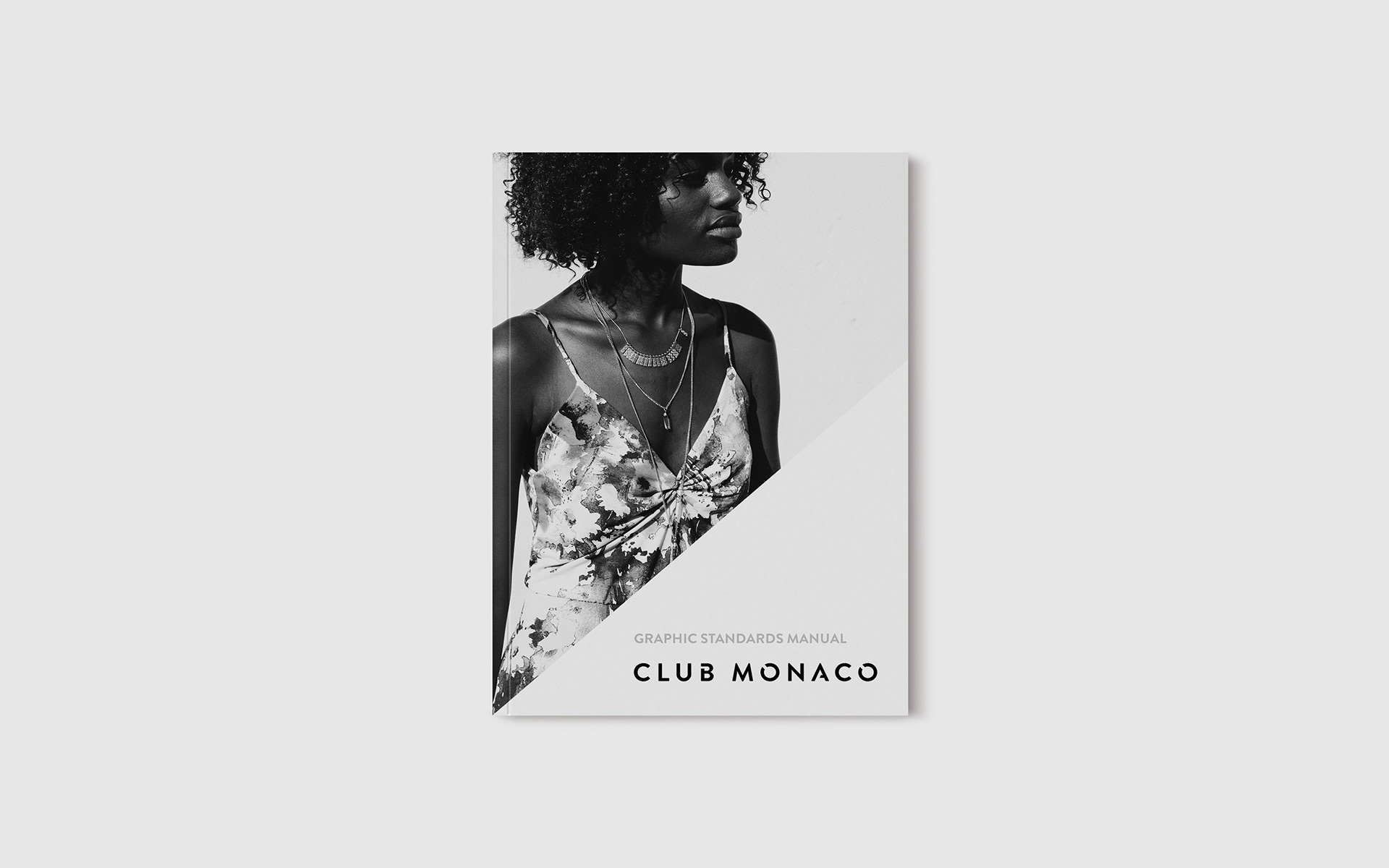
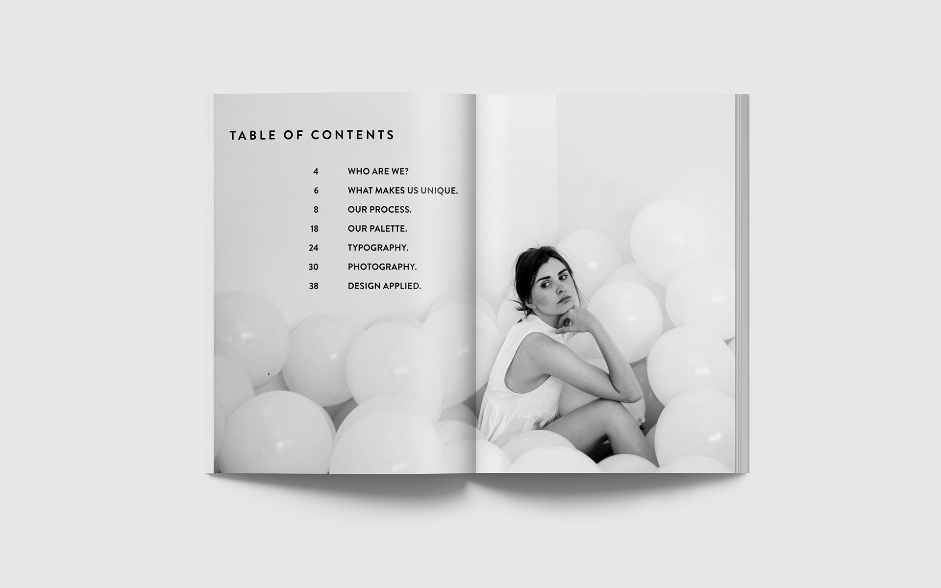
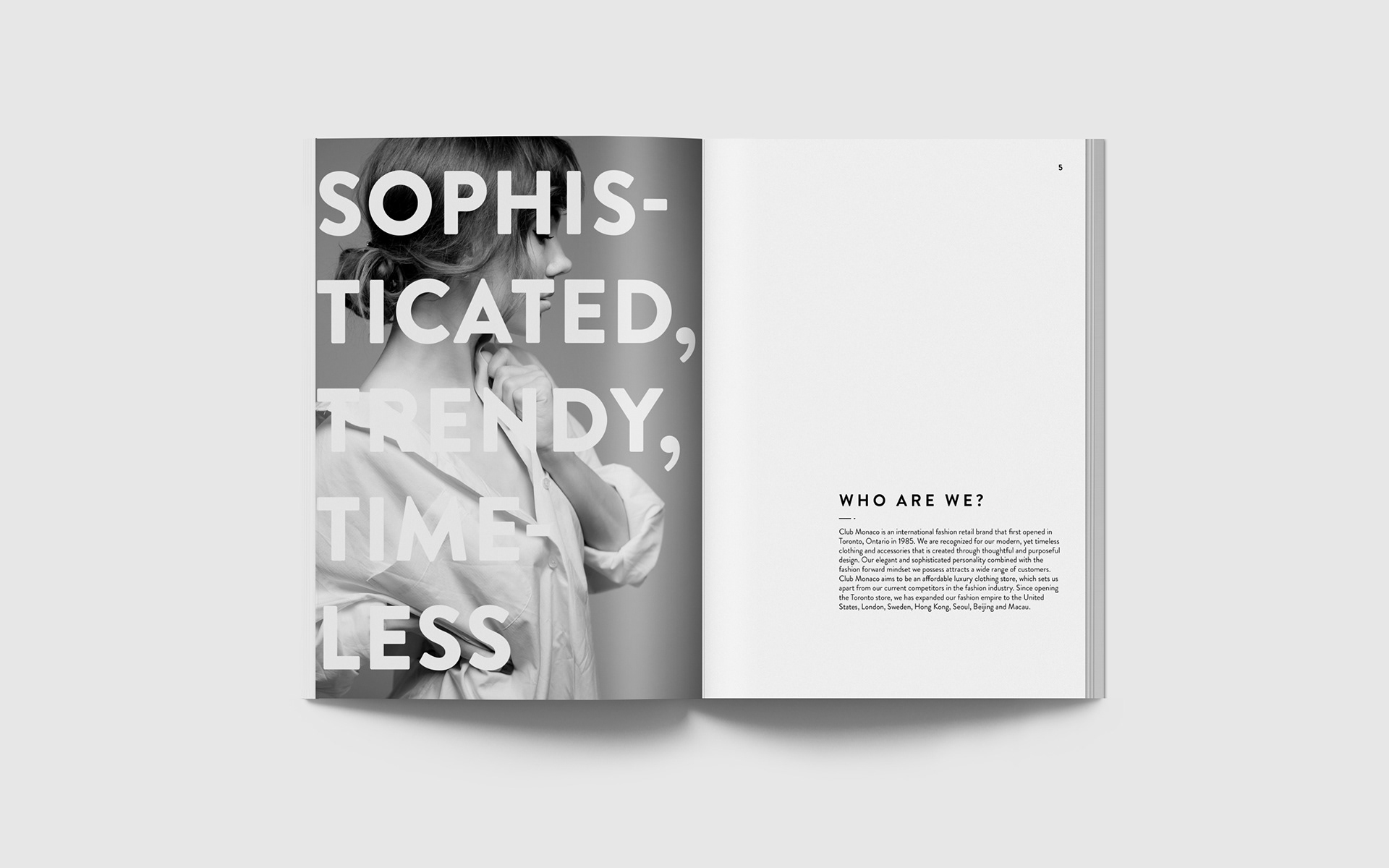
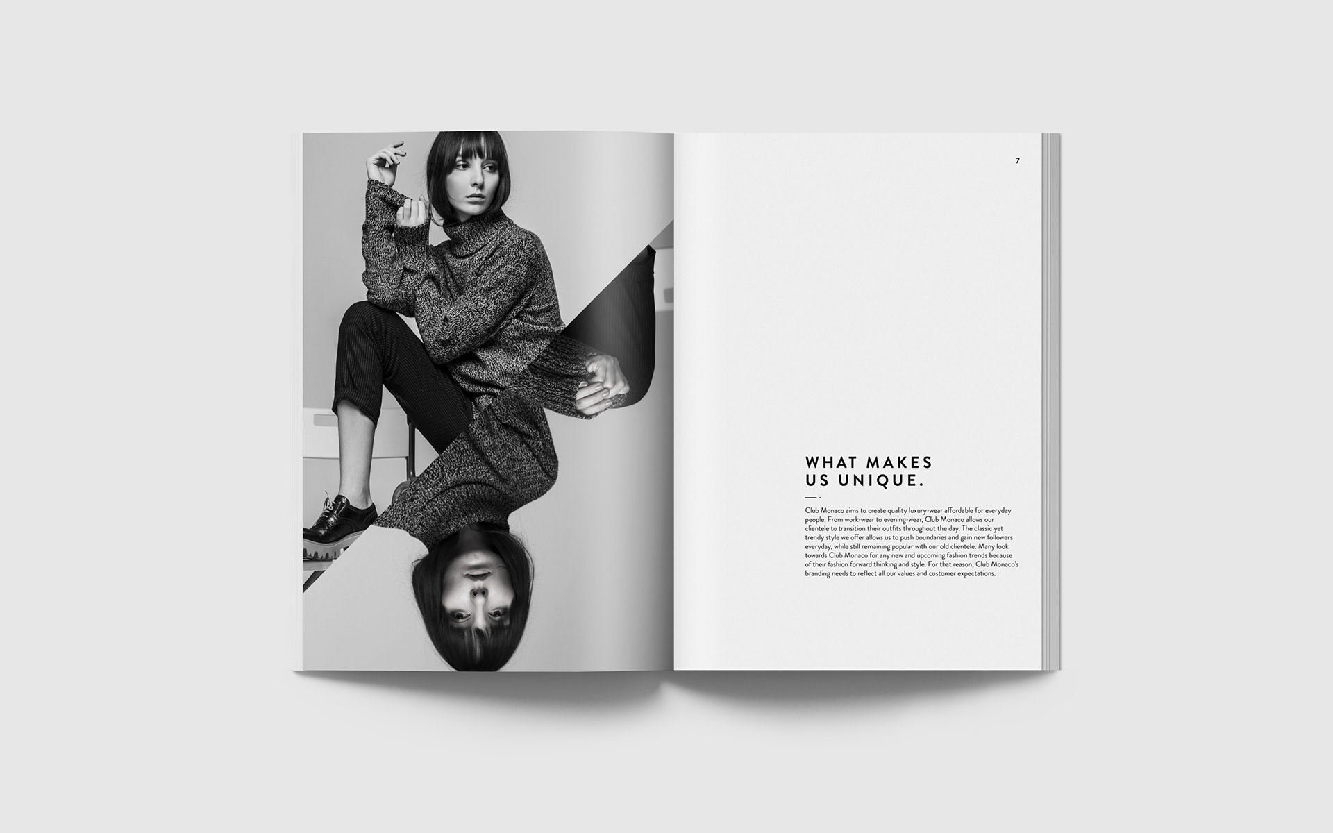
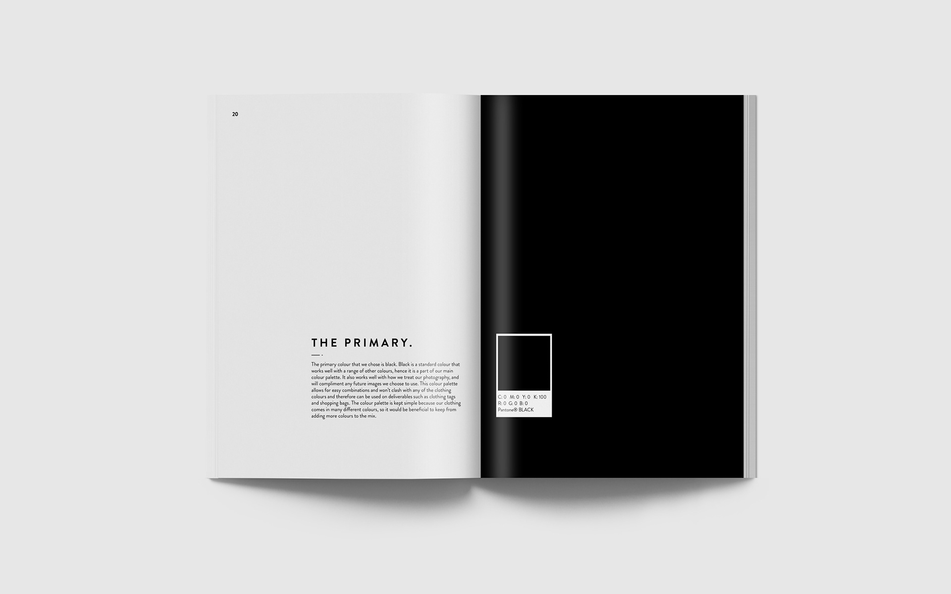
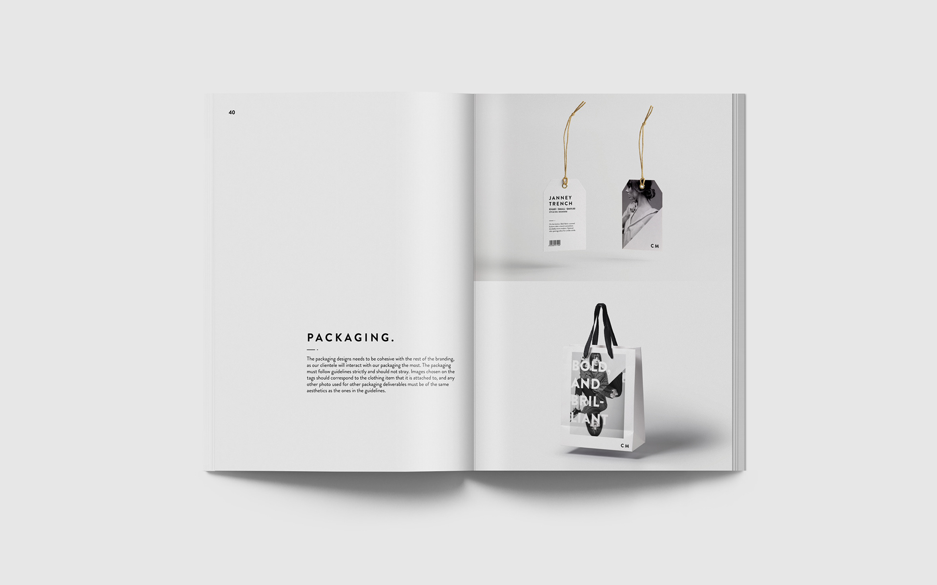
In order to address any issues with inconsistency with the design system, a graphic standards manual was also created to address any concerns or questions about how Club Monaco will should be represented in different aspects. The graphic standards manual is important because it sets standards on how to represent the brand. This will help with any future design decisions that Club Monaco needs to make and will allow for better consistency throughout the brand, which leads to a stronger brand presence and recognition.
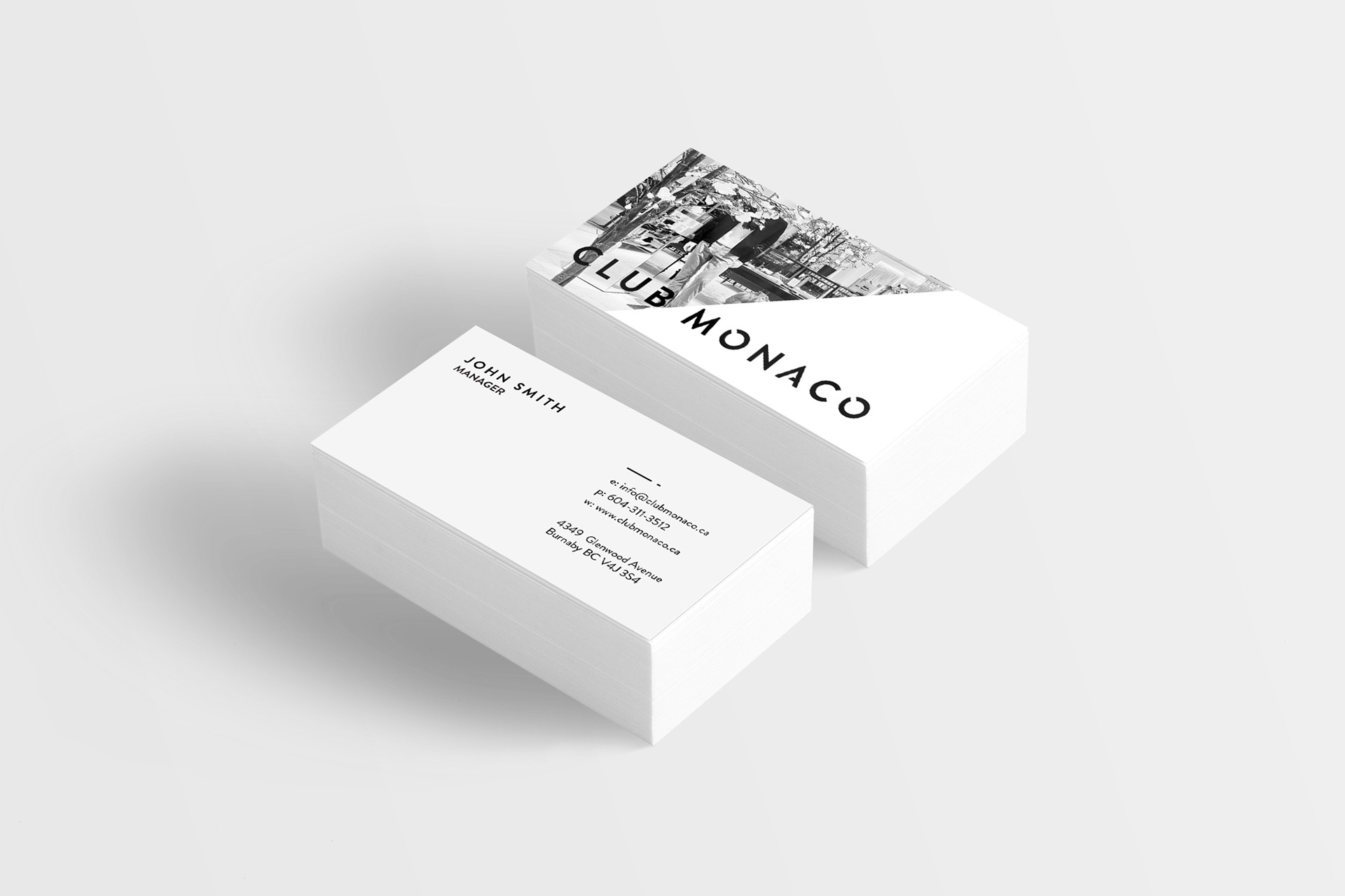
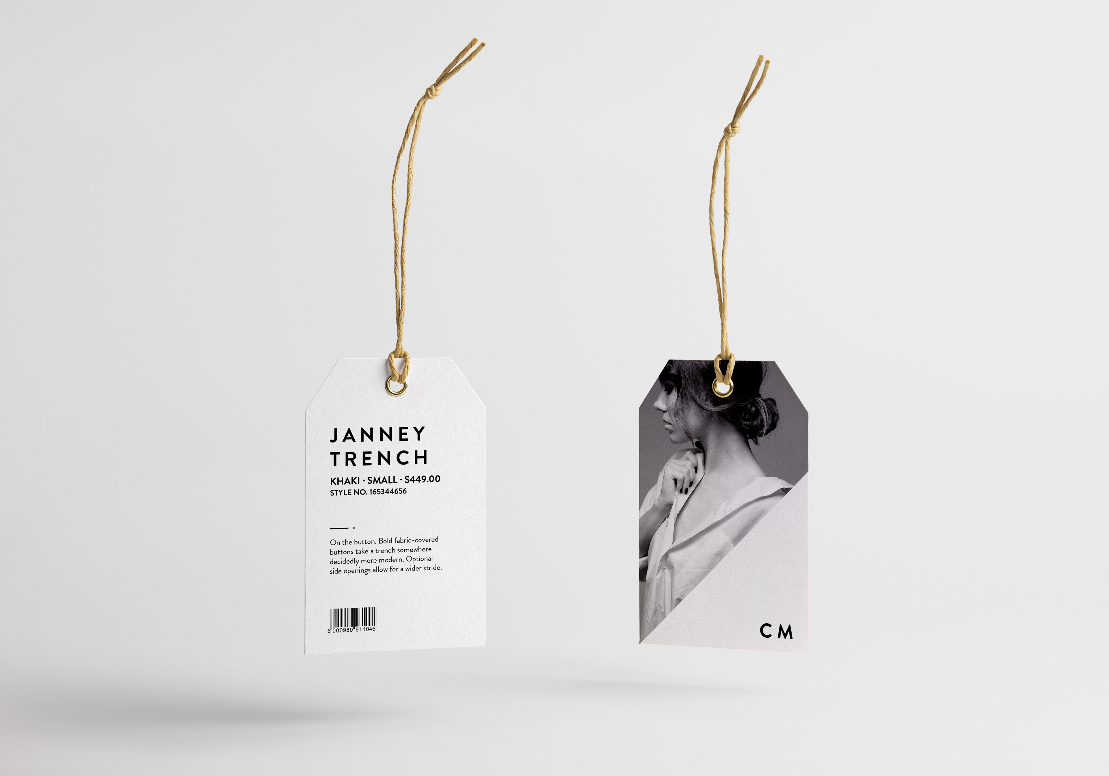
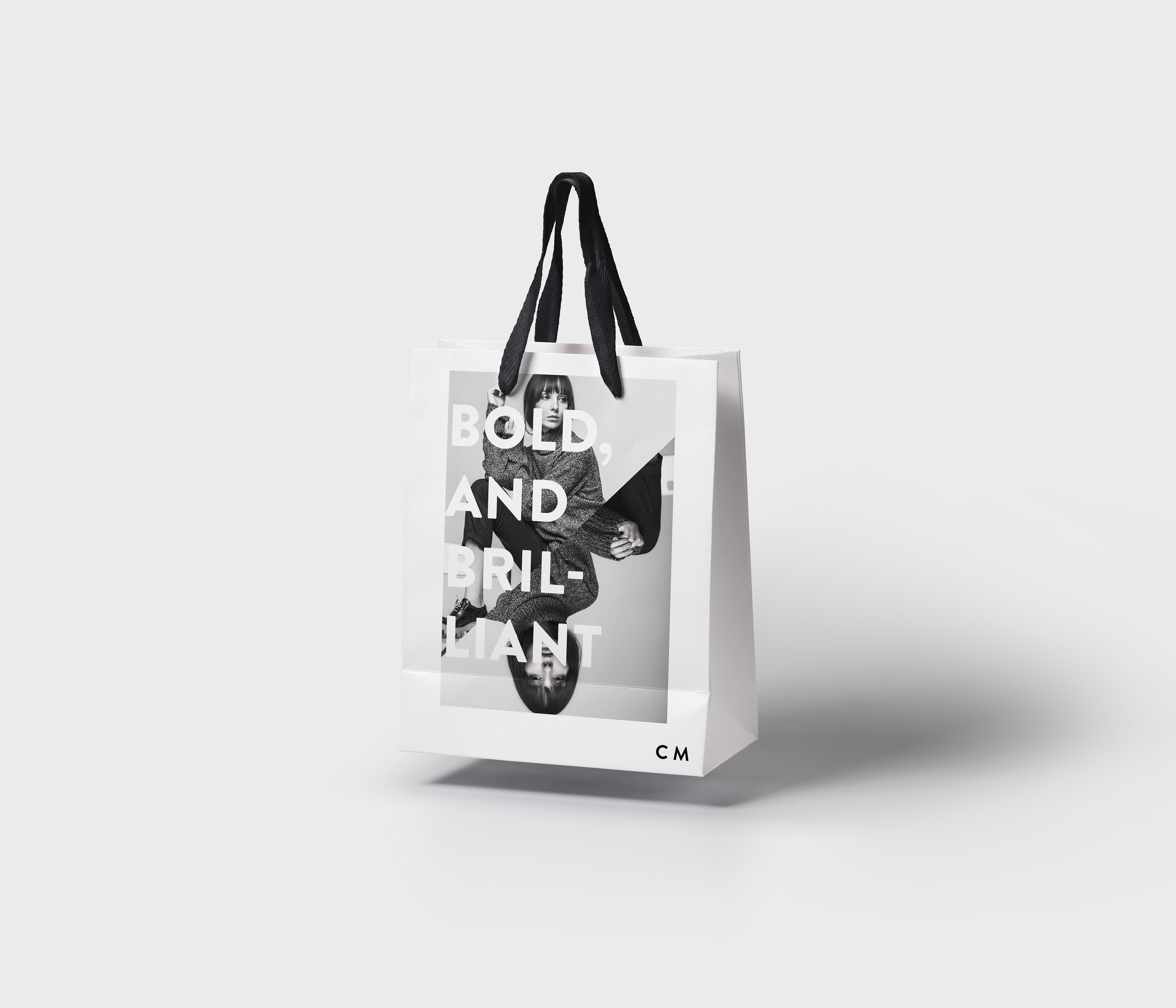
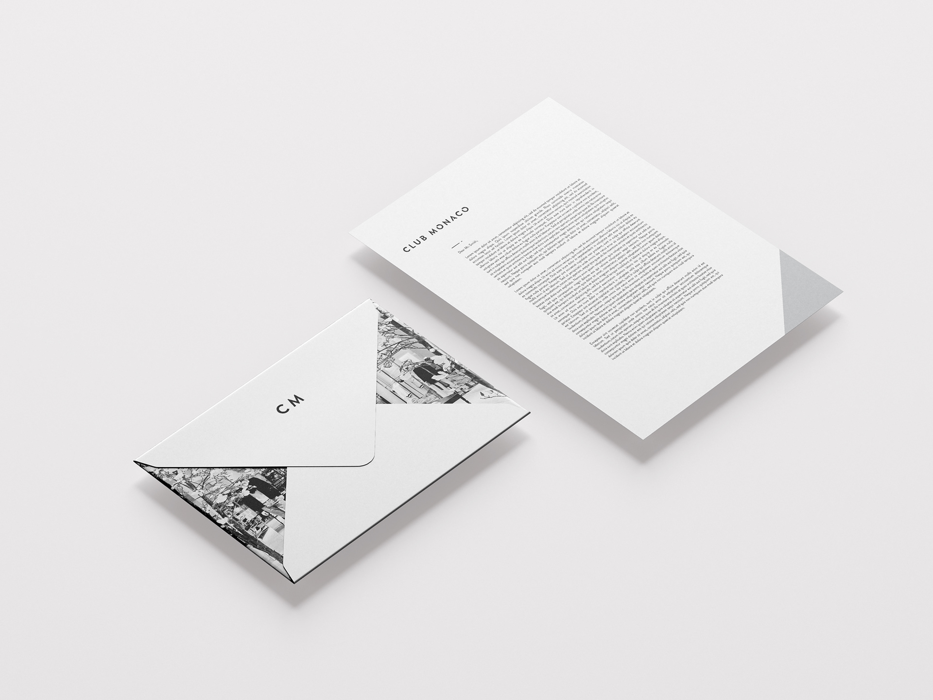
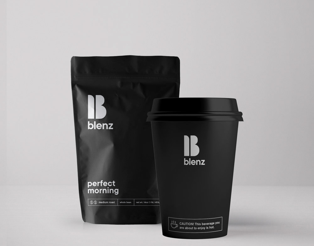
Along with a new logomark and graphic standards manual, the stationery and packaging was created to better allow the audience to understand the new direction of club Monaco’s creative direction. The packaging is one of the first branding material that a customer interacts with. Therefore, it is imperative that the packaging clearly displays Club Monaco’s personality and branding system. The stationery uses images from Club Monaco’s stores. The use of interior photos of Club Monaco will allow for better brand recognition beyond the logomark and packaging.
